SocialPulse Documentation & Matrix Science
SocialPulse is not a black box. This manual details exactly how our analytical matrices are calculated, how you can customize your dynamic dashboards, and how to define your brand's unique ontology.
1. Analytical Matrices (Metrics)
The platform calculates several core matrices in real-time. Understanding these calculations is vital to interpreting your dashboard correctly.
1.1 Global Sentiment Score
The Global Sentiment Score is a weighted average of all post polarities mapped against your active ontology over a rolling 24-hour window.
Mathematical Calculation
Score = (Σ(w_i * p_i) / Σw_i) * 100

Where:
w_i = Influence weight of the author (0.1 to 1.0)
p_i = NLP polarity of the post (-1.0 to 1.0)
1.2 Crisis Velocity Matrix
Velocity measures momentum. It calculates how quickly negative sentiment is spreading relative to normal baseline volume.
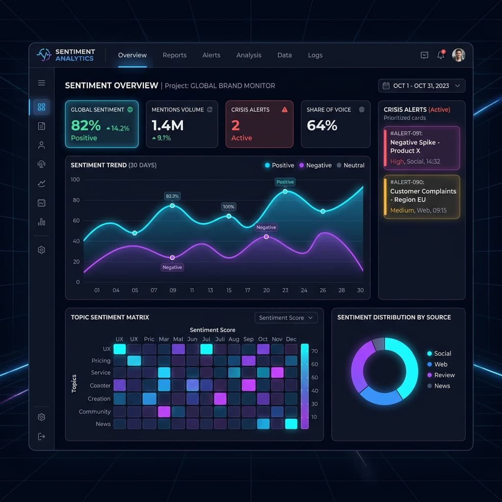
2. Dashboard Customizations & Views
No two analysts work the same way. The SocialPulse dashboard is fully modular.
Drag-and-Drop Widgets
Every graph, table, and matrix on the Overview page is a widget. Click the grid icon in the top right of any widget to enter "Edit Mode". You can drag widgets to reorder them or resize them to emphasize specific data points.
Drag widgets from the library, resize with handles, and the canvas reflows around them — the System Default stays locked as an always-available fallback.
3. Ontology Filters
The global filter bar at the top of the application allows you to slice data by Ontology Nodes. For example, if you are a Telecom, you can filter the entire dashboard to only show posts related to the "Network Outages" node.