Metrics & Calculations
65+ metrics, every formula exactly as the analytics engine computes it, in plain language with a worked example per category — how to read each number and what conclusion it supports.
Sentiment & Trend
Sentiment tells you not just how many people are talking about your brand, but whether that attention is helping or hurting you. These metrics turn raw social chatter into a defensible read on public mood, which topics are driving it, and how fast a situation is moving — the difference between reacting to a headline and catching the problem before it becomes one.
Net Sentiment Score (NSS)
-100 to +100(positive - negative) / total x 100Net Sentiment Score distills the entire conversation into one number by taking positive posts, subtracting negative ones, and expressing the result as a percentage of everything said — driven purely by language, not by likes or views. A reading above +20 signals a healthy conversation, anything from 0 to +20 is lukewarm, and below -20 means detractors are winning the room.
Sentiment distribution
0 to 100% per bucketcount(label) / total x 100 for each of positive, negative, neutral, mixedThis view breaks the conversation into positive, negative, neutral, and mixed shares, each expressed as a percentage of the total, alongside the average tone score. A conversation dominated by neutral posts usually points to factual or news-driven chatter rather than opinion, while a heavy mixed share means people are praising and criticizing the brand in the same post.
Share of Voice (SoV)
0 to 100%volume_group / total_volume x 100Share of Voice measures how much of the total conversation a given brand, topic, channel, or region accounts for. Owning more of the conversation is only an asset when it's paired with positive sentiment — high share alongside negative NSS marks a lightning rod, not a win, so it should always be read side by side with sentiment.
Advocacy vs complaint ratio
0 to 1advocacy_intents / (advocacy_intents + complaint_intents)The advocacy-to-complaint ratio looks only at people who took a clear side, and measures what fraction were recommending or defending the brand versus complaining. A ratio above 0.6 indicates a genuine fan base, while below 0.35 signals that the most vocal customers are unhappy ones.
Brand Health Index (BHI)
0 to 100 (letter grade A+ to F)0.30 x sentiment + 0.20 x (1-controversy) + 0.15 x (1-toxicity) + 0.20 x advocacy + 0.15 x (1-bot share), each scaled 0-100Brand Health Index is the executive-level scorecard, blending sentiment, the inverse of controversy, the inverse of toxicity, advocacy, and the inverse of bot share. It resolves to a letter grade — A/A+ for strong standing, B for stable, C for fragile, D/F for a brand actively being damaged — though the component breakdown should always be checked before acting on the headline grade.
Topic metrics table
mixedper topic: volume, SoV, NSS, controversy, spike z-score, momentum, severity-weighted impactThe topic metrics table lines up every topic in the ontology side by side with its volume, share of voice, sentiment, controversy, spike z-score, momentum, and severity-weighted impact. It's built to be sorted by impact rather than volume, since a small billing complaint can outrank a much larger but harmless marketing conversation.
Severity-weighted impact
0 upward (unbounded)volume x negative_share x topic_severitySeverity-weighted impact ranks topics by the damage they're actually doing, multiplying volume by negative share and by the topic's inherent severity, rather than by sheer loudness. It's the metric to use when deciding what to fix first, since two topics with identical volume can differ threefold in real impact.
Overview KPI cards
mixedeach card = {current value, delta vs prior period, 12-bucket trend, status band}The overview KPI cards are the ten headline numbers on the landing dashboard, each carrying its current value, its change versus the prior period, a twelve-bucket trend line, and a traffic-light status. Red means act today, amber means investigate this week, and green means hold course.
Volume & sentiment series
0 upwardposts bucketed by hour / day / ISO-week, with per-bucket NSSThe volume and sentiment series plots posts bucketed by hour, day, or ISO-week alongside the per-bucket sentiment score, with gaps filled so quiet periods show up as zero rather than vanishing from the chart. Shape matters more than height — a sustained plateau of negative chatter is a bigger problem than a single loud spike.
Rolling average
0 upwardtrailing simple moving average over w bucketsThe rolling average is a trailing simple moving average computed over a chosen window of buckets, smoothing out day-to-day noise from the volume line. Use the smoothed line to judge the trend and the raw line to spot individual events.
Spike z-score
roughly -6 to +6(value - trailing mean) / trailing standard deviationSpike z-score measures how unusual the latest period is relative to that same topic's own recent history. A reading of 2 is notable, 3 is high, and 4.5 or above is critical — and because it's self-referential, a small topic doubling in size is flagged just as reliably as a large one.
Anomalies
mixedbuckets where |z| >= threshold, classified low / moderate / high / criticalAnomalies are the buckets where the z-score crosses a defined threshold, automatically classified and paired with a written explanation of what happened. A spike carrying negative sentiment reads as an incident; a spike carrying positive sentiment reads as a campaign that's working.
Momentum
-100% upward(current period - prior period) / max(prior period, 1) x 100Momentum tracks whether a topic is growing or fading, expressed as the percentage change between the current and prior period. Above +50% a story is accelerating; below -30% it's burning out and may not need a response at all.
Burst episodes
0 upwardKleinberg-lite two-state automaton: bucket is bursting when rate >= s x baseline; weight = summed excessBurst episodes are contiguous periods where the conversation ran far above its normal rate, merged into named episodes with a start, end, and intensity weight. That weight reveals which historical flare-up was truly the biggest, not just which single day looked tallest.
Worked example
A Product Recall Rumor at a Mid-Size Telecom Operator
A mid-size telecom operator (illustrative, not a real SocialPulse customer) starts noticing chatter about a rumored device recall spreading through social channels overnight.
Hour 0
Spike z-score: 4.8
Mentions of the recall topic have jumped far beyond this topic's own recent norm, crossing into critical territory.
Hour 1
Share of Voice (SoV): SoV: 34%
The recall rumor has grown to account for roughly a third of all brand conversation.
Hour 2
Net Sentiment Score (NSS): NSS: -42
The tone of the conversation has turned sharply negative.
Hour 6
Momentum: +85%
Volume has nearly doubled between the two halves of the monitoring window — still accelerating.
Day 2
Brand Health Index (BHI): BHI: 58 (C)
The blended scorecard has slipped into fragile territory.
Day 4
Net Sentiment Score (NSS): NSS: +12
After the company's public clarification, tone has recovered into lukewarm-but-positive territory.
Seeing the spike z-score and share of voice move together told the comms team this wasn't background noise but a genuine emerging story, and the negative NSS combined with accelerating momentum justified an immediate public statement. By the time the brand health grade had dipped to a C, the team could show leadership exactly which components were dragging it down, and the recovery in NSS days later gave a clear, defensible signal that the response had worked.
Controversy & Risk
Sentiment alone tells you whether people like you; it says nothing about whether they're about to organize against you. This group answers the question a PR director actually loses sleep over: is this conversation splitting into hostile camps, and how fast is it moving toward an incident?
Controversy Index (CI)
0 to 1negative / (positive + negative), neutral posts excluded, mixed counted half to each sideControversy Index looks only at the people who picked a side. A reading of 0.5 means opinion is evenly divided; past 0.65 the topic is working against the brand, while under 0.35 the topic is actually helping. All-neutral chatter returns 0.
Polarization
0 to 10.6 x normalised bimodality coefficient + 0.4 x histogram dipPolarization asks whether people have split into two opposing camps with nobody in the middle, built from the shape of the tone distribution. Near 1.0 describes the hardest communications problem there is; near 0 means people broadly agree, whatever the mood.
Bimodality coefficient
0 to 1(skew^2 + 1) / (excess kurtosis + 3(n-1)^2 / ((n-2)(n-3)))The statistical engine underneath polarization: a test of whether the tone distribution has two separate humps. The threshold is 0.555 — cross it and the data supports two distinct camps.
Opinion gap (dip)
0 to 11 - valley_height / min(peak_a, peak_b) on an 11-bin tone histogramMeasures how deserted the middle ground is between a conversation's two loudest camps. A dip of 1.0 means literally no one holds a moderate view.
Consensus
0 to 11 - Shannon entropy(positive, negative, neutral) / log2(3)Consensus measures agreement itself, independent of whether that agreement is happy or angry. A score of 1.0 means the audience is saying essentially one thing; below 0.4 the conversation is too fragmented for one response to land with everyone.
Heat
0 to 100100 x V/(V+k) x mean emotional intensityHeat combines how many people are talking with how strongly they feel, so a small furious thread and a large but indifferent one are never confused. Above 60 the topic is actively burning; under 25 it's background noise.
Controversy verdict
consensus | contested | polarized | inflammatoryrules over heat, polarization, consensus and toxicityTranslates heat, polarization, consensus, and toxicity into a plain-English label. Inflammatory — two camps plus hostility and volume — is the label that means escalate now.
Controversy x volume matrix
mixedx = volume, y = controversy index, bubble = engagement, colour = net sentimentThe bubble chart that shows which topics are both large and divisive at a glance. Top-right bubbles — high volume, high controversy — are the priorities.
Controversy drivers
0 upward (unbounded)|tone| x (0.5 + toxicity) x log(1 + engagement) x (0.6 + 0.4 x intensity)Ranks the individual posts doing the most damage. Responding to the top five of them typically moves the overall metric more than a single broadcast statement.
Controversy keywords
-1 to +1 (lift)lift = CI(posts containing the word) - CI(all posts), ranked by lift x log(1 + count)Finds the words and phrases that reliably show up when the conversation turns against the brand. High-lift keywords are effectively the vocabulary of your critics.
Crisis Risk Index (CRI)
0 to 1000.22 x negative velocity + 0.20 x negative virality + 0.15 x controversy + 0.15 x toxicity + 0.10 x influencer amplification + 0.10 x topic severity + 0.08 x bot amplificationRolls seven weighted signals into one score for how close a conversation is to becoming a reputational incident. Bands run from low (under 25) through guarded, elevated, high, up to severe (80+) — but the same score can call for very different responses depending on which component is driving it.
Negative velocity
0 to 10050% z-score of latest negative volume + 50% negative-volume growth, cappedMeasures how fast anger is accumulating relative to that conversation's own normal baseline. It's the earliest warning signal in the group, typically moving hours before total volume gives any indication that something is building.
Risk component breakdown
0 to 100 eachseven weighted 0-100 sub-scores with their contribution to the totalSplits Crisis Risk Index into its seven underlying sub-scores. Risk driven by bot amplification calls for evidence-gathering; the same score driven by influencer amplification calls for direct outreach.
Risk scenarios
0 to 100 (projected index)contained = CRI x 0.85, persistent = CRI x (1 + m/400), escalation = CRI x (1 + m/150); probabilities from momentum and amplificationProjects three plausible near-term futures from the current index and its momentum. Plan operationally against the escalation scenario while budgeting resources against the more likely persistent one.
Worked example
A Product Recall Rumor, Hour by Hour
A fictional mid-size telecom operator notices chatter after a customer claims a new router model is catching fire, and the social intelligence team watches Controversy & Risk metrics move in real time over a single day.
Hour 0
Heat: Heat: 18
Early mentions are scattered and mild, still reading as background noise.
Hour 3
Negative velocity: Negative velocity: 72
Negative posts start arriving far faster than this topic's normal baseline.
Hour 5
Controversy Index (CI): Controversy Index: 0.81
Over four in five people taking a side are now against the company.
Hour 6
Crisis Risk Index (CRI): Crisis Risk Index: 68
The combined score crosses into the high band.
Hour 7
Risk scenarios: Escalation scenario: CRI 91
Projecting the current trajectory forward shows the escalation path pushing into severe territory if nothing changes.
Hour 8
Heat: Heat: 64
Volume and intensity have both climbed enough that the topic is now confirmed as actively burning.
Seeing negative velocity spike hours before overall volume did gave the team a head start most crisis teams don't get, and the escalation-scenario projection convinced leadership to authorize a same-day public statement. By the next morning heat and controversy index had both pulled back, and the team credited early velocity tracking with turning a potential recall firestorm into a contained, well-documented response.
Audience & Authenticity
Audience quality decides whether your social data is a strategic asset or a mirage. This group gives you both sides: metrics that surface your real influencers, advocates, and critics, and metrics that detect coordinated or bot-driven activity so you never mistake a manufactured spike for genuine demand.
Influence score
0 to 100100 x (0.60 x authority + 0.25 x reach + 0.15 x volume), log-scaled and blended with enrichmentDistills an author's real weight in a conversation into a single number, blending authority, reach, and volume. Above 70 is a genuine mover of opinion; below 20 is a normal customer talking.
Authority
0 to 10.55 x log-scaled followers + 0.30 x engagement quality + 0.15 x topical focusMeasures credibility rather than raw size. A focused account with 20,000 followers can outrank a scattergun account with 500,000 — and that focused voice usually matters more to your specific category.
Reach
0 upwardsum over posts of max(views, followers x 0.10)Estimated impressions: real view counts where the platform reports one, otherwise a conservative 10% of followers. Reach is exposure, not approval — a high-reach negative post is a warning sign, not a win.
Author tier
nano | micro | macro | mega | verified_mediaverified media / mega (1M+) / macro (100k+) / micro (10k+) / nanoSorts every voice into standard influencer size bands. Nano and micro accounts are usually where authenticity lives; macro and verified-media accounts are the ones that turn a story into an escalation.
Author leaderboard
mixedauthors ranked by influence score, with voice share = influence / total influenceRanks everyone by influence score and shows voice share. If the top five accounts control more than a third of total voice share, you're looking at a conversation being led, not one that emerged naturally.
Advocates & detractors
mixedauthors with NSS >= +40 (advocate) or <= -40 (detractor), weighted by influence x |NSS| / 100Isolates the authors with the strongest public stance in either direction. Both lists stay short by design: engage your top detractors directly, and hand your top advocates something worth amplifying.
Near-duplicate clusters
mixedMinHash + LSH candidate generation, exact Jaccard verification, union-find mergeGroups content that's saying essentially the same thing in nearly the same words. A cluster of 30 near-identical posts is one message repeated 30 times, not 30 independent opinions.
Burst-timing correlation
0 to 11 - min(1, median gap between posts / 60 minutes)Scores how suspiciously synchronized a group of posts is. Near 1.0 means the posts landed within seconds of one another — a timing pattern no organic audience produces.
Handle-pattern score
0 to 10.5 x share of template handles + 0.5 x (1 - handle character entropy)Checks whether account names in a cluster look machine-generated. Once the score crosses 0.6, the handles were almost certainly created in bulk.
New-account cohorts
0 to 1 (suspicion)authors bucketed by account age; suspicion = 0.4 x volume share + 0.4 x bot score + 0.2 x negative shareBuckets authors by how recently their accounts were created. A young cohort carrying a large, angry share of the conversation is the classic astroturf signature.
Coordination score
0 to 10.35 x similarity + 0.30 x burst timing + 0.20 x handle pattern + 0.15 x new-account shareThe composite read on whether a cluster of posts is an organized campaign. 0.70+ is treated as confirmed — confirmed clusters should be stripped out of sentiment reporting.
Authenticity score
0 to 100100 - (0.45 x bot share + 0.35 x coordinated share + 0.20 x new-account share)Answers how much of a conversation you can trust as real people expressing real views. Above 90 the data is clean; below 55 the conversation is being actively manufactured.
Worked example
Spotting a Manufactured Backlash: A Telecom Operator's Launch Week
A mid-size telecom operator rolling out a new data-plan pricing tier, watching brand conversation the week of launch.
Day 1, 9am
Authenticity score: Authenticity score: 92
Launch-day chatter looks clean and organic.
Day 2, 2pm
New-account cohorts: New-account suspicion: 0.71
A wave of complaints traces to accounts created in the past month.
Day 2, 3pm
Coordination score: Coordination score: 0.68
The cluster behind the complaints scores as likely-to-confirmed organized activity.
Day 2, 4pm
Authenticity score: Authenticity score: 61
Overall trust in the conversation drops into caution territory.
Day 3, 10am
Advocates & detractors: Top 5 genuine detractors identified
Once the coordinated cluster is excluded, the real, influence-weighted list of legitimate critics emerges.
Because the platform separated the coordinated cluster from organic sentiment instead of blending them into one volume number, the comms team excluded the manufactured backlash from its public reporting and avoided overreacting to a campaign rather than a customer trend — redirecting response effort to the small number of real, influence-weighted detractors instead.
Narrative & Network
A brand crisis rarely announces itself as one story — it is usually several overlapping narratives converging on the same handful of topics. These metrics show which story-lines actually exist, which are gaining speed, and which single topics are quietly connecting complaints into a larger narrative.
Narratives
2 to 8 clusterscosine k-means with deterministic farthest-first seeding, k = clamp(sqrt(N/3), 2, 8)Lets the audience's actual story-lines surface on their own rather than starting from a keyword list. Each cluster represents a genuinely separate message, so a single response rarely covers more than one.
Narrative stance
critical | supportive | mixed | neutralcritical (NSS <= -20) / supportive (NSS >= +20) / mixed (polarized middle) / neutralShows whether a story-line is running critical, supportive, neutral, or mixed. A mixed reading means the same narrative is being cited by both sides — correct the facts before picking a side.
Emerging narrative flag
true / falsemomentum >= 25% AND recency >= 0.40 AND at least 3 postsCatches narratives that are still small but picking up speed and recency. Cheap to address today, considerably more expensive if left until next week.
Narrative map
unitless coordinates2-D PCA by power iteration with Gram-Schmidt deflationProjects every post into two dimensions so similar posts land near one another. Tight, separated islands indicate genuinely distinct conversations; one large smear means the topic is really just one blurred discussion.
Topic co-occurrence
0 upwardcount of posts mentioning both topicsCounts how often two subjects show up together in the same post. Strong co-occurrence tells you which complaints travel together, so resolving one often quiets the other.
Association lift
0 upward (1 = independent)P(a and b) / (P(a) x P(b)) = c_ab x N / (c_a x c_b)Checks whether two topics appear together more often than chance alone would predict. A lift above 2 signals a real association; near 1 the pairing is coincidental.
Degree centrality
0 to 1connections / (nodes - 1)How connected a topic is to the rest of the conversation. High-degree topics act as hubs nearly every complaint gets routed through.
Betweenness centrality
0 to 1Brandes: share of shortest paths between all topic pairs that run through this topicIdentifies which topic bridges otherwise separate parts of the conversation — where a narrow service complaint tends to turn into a broader brand narrative.
Topic communities
mixeddeterministic label propagation over the weighted co-occurrence graphGroups topics that are habitually discussed together. These clusters often make better reporting categories than the org chart does.
Worked example
Tracing a Service Outage into a Brand Narrative
A mid-size telecom operator experiences a regional network outage during a holiday weekend and monitors how the online conversation develops over the following days.
Day 1
Narratives: 3 narratives
The conversation splits into three story-lines: the outage, billing/refunds, and competitor comparisons.
Day 1
Topic co-occurrence: outage + billing: 214 posts
A large share of posts mention both the outage and billing in the same breath.
Day 2
Betweenness centrality: 0.62 for billing
Billing sits on most of the shortest paths linking the outage to the competitor-comparison discussion — the bridge topic.
Day 2
Emerging narrative flag: true, momentum 41%
The competitor-comparison narrative is accelerating and heavily concentrated in the recent window.
Day 3
Narrative stance: mixed, NSS -4
The billing narrative is being cited both to criticize and to defend the company.
Seeing that billing acted as the bridge topic rather than the outage itself, the team issued one clear statement on automatic refunds, addressing both the technical and financial narratives at once. Because the emerging-narrative flag caught the competitor comparison while still under ten posts, the team got ahead of it before it grew into its own news cycle.
Competitive, Geography & Divergence
A brand's loudest quarter can also be its most damaging one, and raw share-of-voice or engagement counts can't tell the difference. This group shows where a brand truly stands against rivals, region by region and language by language, and proves when a 'successful' viral moment was actually a crisis mislabeled as a win.
Competitive scorecard
mixedper brand: volume, SoV, share of positive voice, NSS, brand health, controversy, deltasLines up every tracked brand against the same measures, separating share of voice from share of positive voice — exposing the brand that talks the loudest but owns none of the actual goodwill.
Positioning matrix
leader | challenger | lightning_rod | nichex = share of voice, y = net sentiment, split at the median SoV and NSS = 0Plots every brand on a four-quadrant map. Landing in the lightning rod quadrant — loud but disliked — is the most dangerous place to be, though usually the fastest to escape once the driving topic is fixed.
Head-to-head comparison
mixedper brand pair: gaps in NSS, SoV and brand health, plus the topics with the widest advantagePairs a brand against each rival directly, surfacing the specific topics where the advantage is widest — effectively writing the messaging brief.
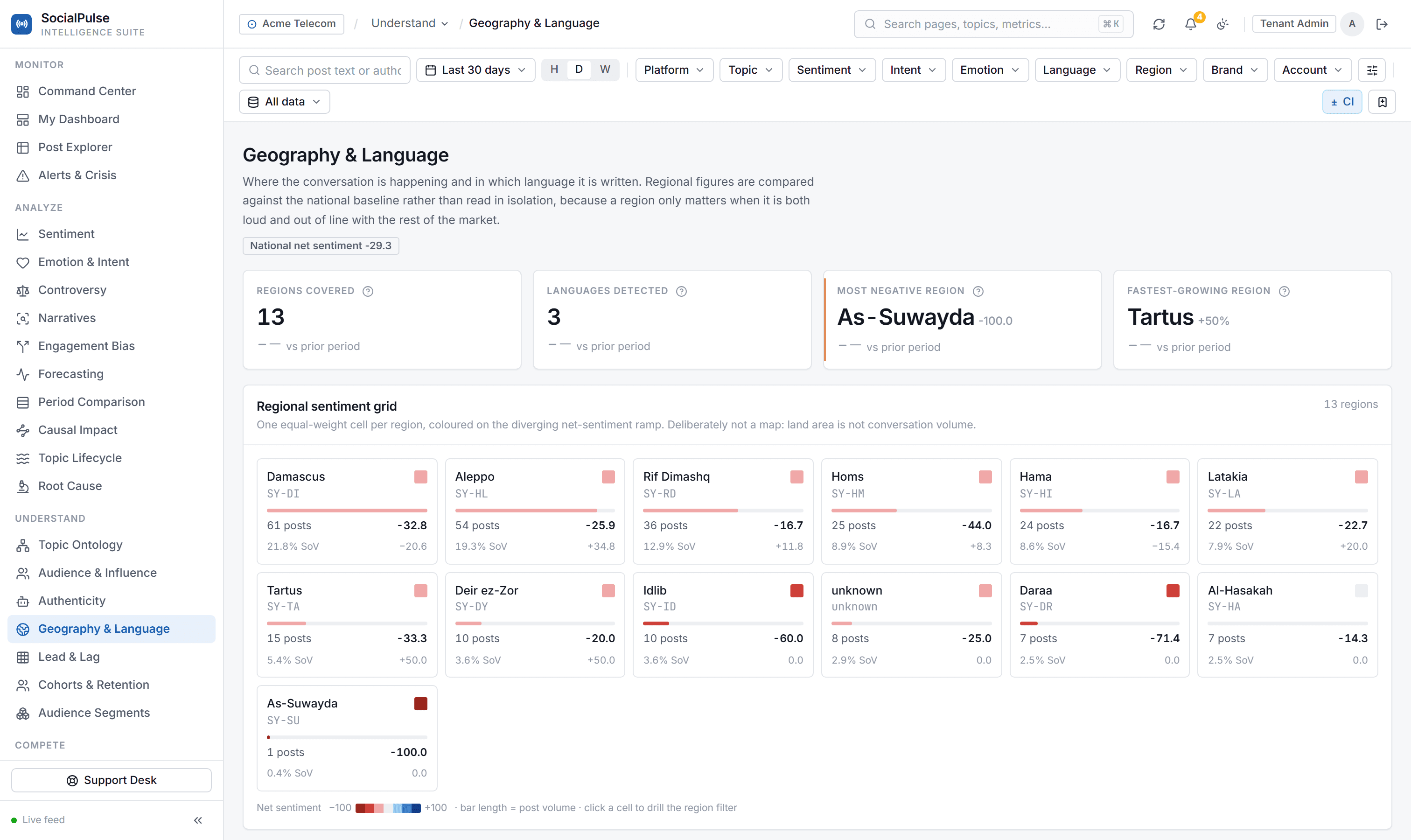
Regional breakdown
mixedper region: volume, share of voice, NSS, sentiment gap vs national, controversyReveals where the conversation is concentrated and where the mood departs from the national norm. A large negative sentiment gap in one region usually signals a local issue, not a brand-wide one.
Geographic hotspot score
0 upwardshare of volume x max(0, -sentiment gap)Multiplies a region's share of volume by how far its sentiment falls below the national average — built specifically to guide where field teams get sent.
Language breakdown
mixedper language: volume, share of voice, NSS, dominant topicCompares sentiment across language communities. Diverging sentiment usually means the audiences are hearing genuinely different messages.
Engagement bias index
-200 to +200 pointsNSS measured by an engagement-only tool minus the true, text-derived NSSMeasures how badly a legacy, engagement-only tool would misreport this dataset. Above +40 points, engagement-based reporting is worse than useless.
Engagement-sentiment correlation
-1 to +1Pearson r between engagement percentile and text toneThe statistical proof of the product thesis: does popularity actually track approval? Near zero means engagement carries no information about sentiment.
Misleading posts
mixedtone <= -0.4 AND engagement percentile >= 0.80, ranked by |tone| x percentile x log(1 + engagement)Flags popular, furious posts that an engagement-only tool would have counted as brand wins — the most persuasive exhibit in any executive readout.
Worked example
Catching a Lightning Rod Before It Strikes Twice
A fictional mid-size home goods chain preparing its quarterly brand review notices its social volume spiking for a third straight week.
Day 1
Positioning matrix: Lightning rod quadrant
Above-median share of voice paired with negative net sentiment — the most dangerous quadrant.
Day 1
Competitive scorecard: SoV 34% vs. share of positive voice 9%
Dominating the conversation by volume while owning almost none of the positive sentiment.
Day 2
Geographic hotspot score: 62 (highest of all regions)
One metro region is both unusually loud and far angrier than the national average.
Day 3
Engagement bias index: +47 points
A legacy engagement-only tool would have overstated goodwill by 47 points.
Day 4
Positioning matrix: Challenger quadrant
After fixing a delivery delay in the hotspot region, sentiment recovered enough to move out of the lightning rod quadrant.
With the hotspot score pointing to a single region and the bias index proving a legacy engagement dashboard would have missed the problem, the PR team fixed the regional delivery issue directly rather than running a brand-wide campaign, then briefed leadership using the positioning matrix shift as proof the response worked.
Forecast & Alerting
A brand's exposure doesn't stop when the analyst logs off. This group turns raw sentiment and volume history into a forward-looking view, tells you honestly how much to trust that view, and makes sure the right person is notified the moment a real threshold is crossed — without repeat pings for the same ongoing issue.
Sentiment & volume forecast
same units as the forecast metricHolt damped-trend exponential smoothing, ETS(A,Ad,N), grid-searched parametersProjects sentiment or volume over the next N periods with a confidence band. Use the direction and band width, not the exact number — social data is noisy and the band is honest about that.
Prediction interval
same units as the forecast metricyhat +/- 1.96 x sigma_hThe 95% confidence band around the forecast, which widens the further ahead you look. If it spans both positive and negative sentiment, shorten the horizon rather than acting on the number.
Forecast error (MAPE)
0% upwardmean(|actual - predicted| / |actual|) x 100 on a held-out tail of the seriesHow wrong the model was on average, backtested against data it hadn't seen. Under 15% is trustworthy, 15-30% is directional, above 30% is a talking point only.
Forecast confidence
high | medium | lowhigh (MAPE < 15 and 20+ points), medium (MAPE < 30 and 10+ points), else lowA plain rating of how much weight to put on a forecast. Low confidence almost always means not enough history yet.
Alert rule
mixedmetric <comparator> threshold, evaluated over a rolling window with optional topic/brand scopeA saved condition that watches one metric and raises an alert when breached. Scope rules to a topic wherever possible — global thresholds either miss local problems or fire constantly.
Alert cooldown & dedup
minutesone live alert per (rule, topic, brand); repeats suppressed for cooldown_minutesPrevents a single ongoing problem from generating the same alert every refresh. Shorten the cooldown to be re-notified sooner rather than creating a duplicate rule.
Alert lifecycle
active | acknowledged | resolvedactive -> acknowledged -> resolved (resolved is terminal)The workflow state of an alert as the team works it. Acknowledge means someone owns it; resolve means the underlying condition is gone, not just that the shift ended.
Worked example
Watching a Product Recall Ripple Through Social Sentiment
A mid-size consumer electronics brand has an alert rule watching sentiment on its flagship product line after issuing a minor recall notice.
Day 1, 9am
Alert lifecycle: active
The rule breached as recall coverage picked up and sentiment turned sharply negative.
Day 1, 9:15am
Alert lifecycle: acknowledged
A PR analyst claimed the alert.
Day 1, 10am
Sentiment & volume forecast: trending further negative, widening band
The forecast showed the negative trajectory likely continuing rather than being a one-hour blip.
Day 1, 10am
Forecast confidence: medium
Enough data to plan around, not enough to bet the whole response on.
Day 3
Forecast error (MAPE): 12%
A fresh backtest showed the forecast accurate to within 12%, upgrading it into the trustworthy range.
Because the alert was scoped and deduplicated, the team got one actionable ping instead of a flood, and the forecast's confidence rating told them how much weight to put on the early read. Once the backtested error came in under 15%, they greenlit a proactive statement ahead of the trend worsening.